

Noticed some changes to our colours and branding?
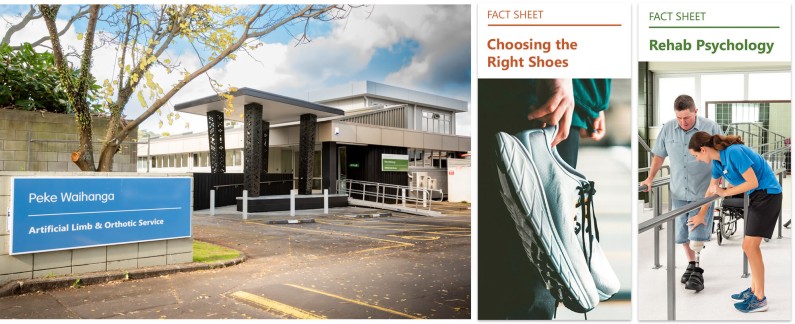
Following patient and staff brand surveys conducted last year, we've made a series of updates to streamline and strengthen our brand, while keeping the elements people value most.
Feedback was overwhelmingly positive. Both staff and patients expressed strong support for the Peke Waihanga brand, its story, and its friendly, approachable feel. Patients particularly valued the use of Te Reo Māori alongside English and the colours, particularly the calming blue. Staff highlighted their pride in the Peke Waihanga identity and the importance of greater consistency across our communications.
Importantly, survey respondents did not support a major rebrand. Instead, they wanted us to keep what works well, while making the brand clearer, more accessible and more consistent.
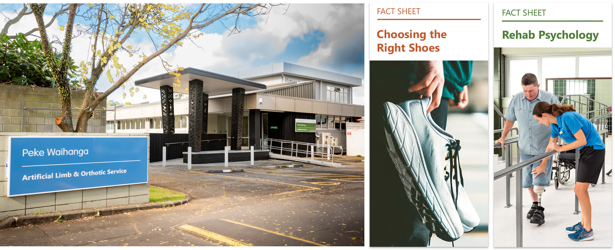
From left to right: Blue represents Peke Waihanga (street sign at Auckland centre), orange is used for orthotic patients and green for amputees.
What's changing?
To better reflect our core services and improve accessibility, we’ve introduced several updates:
- The Peke Waihanga blue has been updated to a more accessible shade.
- The Orthotic Service orange has been updated to a more accessible shade.
- A new accessible green has been introduced to represent the Artificial Limb Service
- Peke Waihanga remains our single organisational logo. (The Artificial Limb Service and Orthotic Service are now represented by colour rather than separate logos.)
- Our font has changed to provide greater consistency across print and digital materials.
Due to the high number of materials to update, these changes will be introduced progressively over the coming months. Fact sheets, booklets and other resources will be updated as they are reviewed or reprinted. Signage updates will take longer due to the scale and cost involved.
These brand changes are designed to make it easier for patients to find the information and services they need – and on that note, look out for our refreshed website – coming soon!
Back